Translate

Sunday, February 12, 2012

Harry Potter Flags from the Triwizard Tournement - The Beauxbatons Academy of Magic from France

The French Team is an all girls school

In 2005 the Harry Potter franchise saw the release of the its fourth film Harry Potter and the Goblet of Fire. In it there is an exchange program between schools for the Triwizard Tournament. Two other schools of magic come to Hogwarts to compete - one from France and the other from Bulgaria. Coincidentally a stylized letter 'B' on a quartered shield of arms are represent the French Academy of Magic.

Dark and light blue colours

Someday J.K. Rowling will release the rights and allow writers, hopefully French to expand and write about the Adventures at Beauxbatons Academy of Magic. French Harry Potter heads would probably consume Beauxbaton Adventures like popcorn-crack.


The all girls school of magic from France
with Champions Banner

Beauxbaton allows no boys! It's an all girls school and some women would prefer to learn all about magic without men to influence or distract them from their magical talents.


A small pennant for Allez

Cheers form the French "Allez," which basically means "come on" in English or "ganbate" in Japanese. Five pointed stars are important symbols for Beauxbatons Academy of Magic.

Harry Potter Vexillum - Banners from the Goblet of Fire

Banners and Vexillums

A few Harry Potter Vexillums and banners wave in the Goblet of Fire 2005. In the fourth film Harry is chosen to compete against two other schools of magic in the Triwarzads Tournament. Suffice it to say Harry is mildly successful. On the left and right are banners held up by two poles while the vexillum is held up by a cross pole - to permanently unfurl a flag without the need for wind.


Golden Harry Flag with Gold Stamp

Once Harry opens the Golden Dragons Egg a horrible shriek shouts across the room. In this scene, clear glimpses of Harry's vexillum's are shown. On a background of red, Harry is scrawled in gold in chief above a yellow square like icon.


Close up of Yellow Potter Dragon Vexilloid

Harry gleefully opens his Dragons Prize with a frightful surprise. To the right of the egg is a yellow vexillum to honor and encourage Harry on this quest to outwit the dragon. Behind Harry's head is another banner for Gryffindor.

Harry's name with yellow lightning bolt border

Everyone is excited to see the egg open up! The banners or vexillums made in Harry honor are clearly seen.


We Love Harry Potter

The banner to Harry right has the shield of arms for Gryffindor. It has a white lion rampant on a quartered shield with Gryffindor's livery - yellow and red. To the left of Harry is a vexillum with livery and his first name outlined with a lightening bolt.


Saturday, February 11, 2012

Customers Bank and Bank of America

Bank of America Logo
notice US Flag Motif

Using the US flag as a commercial logo is considered by some and the US Flag Code as inappropriate. However two companies that successfully use the US flag in their logo are Bank of America and Customers Bank. Customers Bank does it in totality while Bank of America uses a stylized version of the US flag.

Bank of America and Customers Bank are two banks from different ends of the spectrum. Bank of America is a Mega-Bank with a global reach and an ocean of power, while Customers Bank is a small Micro-Bank with a small and efficient reach and full of puddle power. At the moment they illustrate the difference between a strong big vs a small quick business. No doubt if Customers Bank grows to 250-500 outlets, will it be taken over or absorbed by a Mega Bank as happened with Commerce Bank with TD Bank. When this happens the Customers Bank icon with go the way of the red, white, and blue Commerce Bank logo.

Customers Bank is headquartered in Pennsylvania and led by Jay Sidhu. The current company logo consists of the US flag on a red disc. It is coincidentally a combination of the Japanese and US national symbols. Bank of America traces its origins to the West Coast in California in 1904 of the efforts of Amadeo Giannini.

Customers Bank Logo
A mix of Japanese and US Symbols

Banks are basically legal loan sharks with open rules. Rules that operate under official law. They are supposed to help others by helping themselves. Banks are like bacteria, most are good, but a few go bad and harm the system. Bad banks only help a few, while good banks help many.

Good Bank dolphin, Bad Bank shark.

Link to Bank of America
https://www.bankofamerica.com/


Link to Customers Bank
http://customersbank.com/

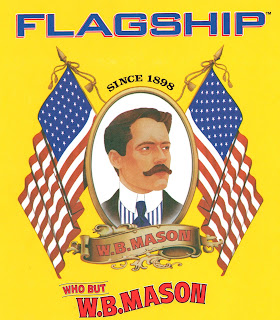
Flagship Paper Products

Flagship Paper Products Logo

The logo of Flagship - W.B. Mason utilizes the US flag and elements of heraldry. The US flag is on the left and right sides of the portrait in the traditionally supporter position.


Link to corporate website
http://www.wbmason.com

Flag of Livingston Island, Antarctica

Flag of Livingston Island
Antarctica

The colours and design are based on the Sami Flag in Scandinavia - red, yellow, green, and blue. White is added for emphasis for snow. The stars represent the most southern constellation - Octans the Star Compass with the Southern Star represented by the green eight pointed star with a white fimbration.

Similar to the Sami Flag yet it has elements of EU flag as well.


Flag of Hearst Island - Antarctica

Flag of Hearst Island
Antarctica

Hearst Island Antarctica flag is based upon the flag of Greenland in conjunction with the constellation Octans the Star Compass.


Flag of Rothschild Island - Antarctica

Rothschild Island
Antarctica

The design of Rothschild Island is based upon the Nenets flags of Russia. The Nenets are a group of people who live in between Asia and Europe. Reindeer herding is a national way of life for these polar men of Eurasia.

The colour scheme is based on colours found on penguins - black, white, red, orange, and yellow. The constellation above represents Octans the Star Compass.